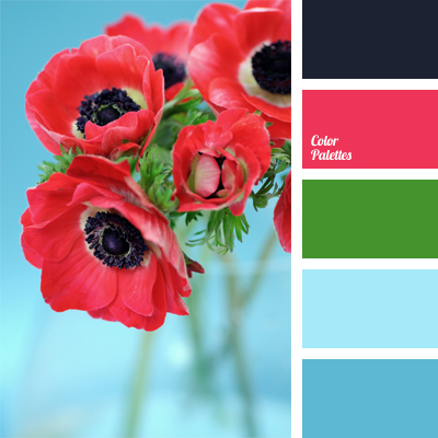
Bright and positive palette.
It is based on the contrast of red and dark blue with green and turquoise colors; raspberry red is the dominant color in the palette, the main focus.
Black shades out and balances this palette.
It is suitable for decoration of festives or banquets, especially those held in the spring. Also perfect for a child’s room interior.
Palette is good for bouquets decoration.
In the clothes it is good for bright accessories.