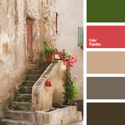
Excellent contrast of pastel hues and bright crimson shades. The colors go together so harmoniously that it is impossible to take your eyes off.
This color solution will look appropriate in kitchens of those housewives who appreciate calm tones with a touch of individuality. A bedroom decorated in this range will be pleasant to look at, too.