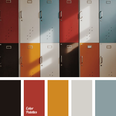
Bright summer tones of red and orange are beautifully shaded with brown, white and soft blue. These are the colors of lightness and carefree days, beautiful desserts in small cafes with a cozy atmosphere and happy long-awaited travels. This color palette embodies cheerful and perky personalities with great love for every day.
Photo by moren hsu.