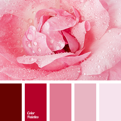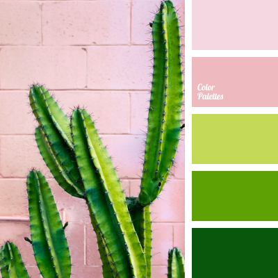
Opposite shades of pink and rich green create a harmonious, spectacular lively combination. Invigorating berry pink is a good solution for a beautiful combination with light green shades. Unusual compositions will help present cultural venues favorably, enrich modern galleries and emphasize an extraordinary and bold character.
Photo by Nelson Flores.