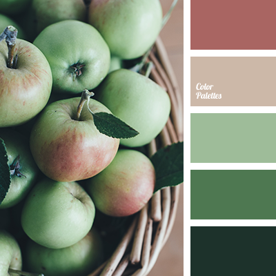
The pastel “apple” color palette is a variation of the classic contrast of red-green hues. In such a solution, the combination of red and green brings more calmness and relaxation than the usual dynamics, which creates favorable conditions for its use in the interior of a living space. The only important thing you should take into account is a sufficient daytime lighting of the room and not to “darken” it much.
Photo by Annie Spratt on Unsplash.