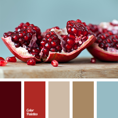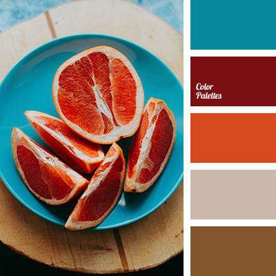
It is easy to agree that a contrasting gamut of bright colors can invigorate and improve mood, and give confidence. And in order not to oversaturate the colors and not tire the eyes, we recommend combining them with calm basic tones. This palette is valuable by combining bright blue and reddish-orange colors, with deep burgundy, soft brown and very light gray-beige. It is applicable both for modern kitchen design, living room or restaurant, and for an interesting feminine look.
Photo by Zoriana Stakhniv on Unsplash.