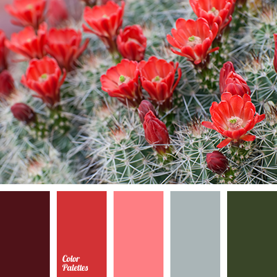
Beautiful and admirable composition. Coral color always looks contrasting and original with green. These bright colors are appropriate to put expressive accents. Calmer shades, namely grey and pink, may become the basis for them. Burgundy adds to this gamma depth and solidity. Palette is great to express loud and catchy interiors that should be appreciated by connoisseurs of design.