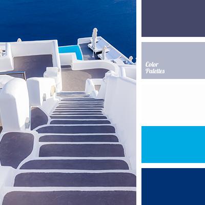
The quiet and fresh composition. Rather reserved, but not boring. More relaxing and peaceful. Bright blue and deep blue are in harmony with the neutral gray tones. This combination creates a perfect balance: all the colors supplement each other absolutely. The palette will ideally fit marine and beach cottage interiors.