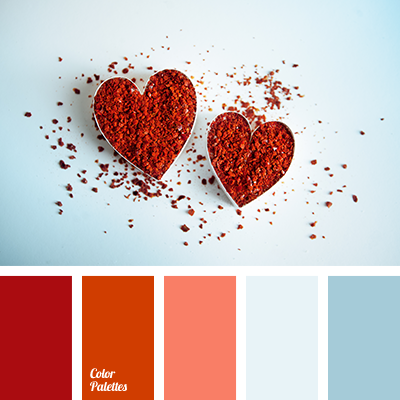
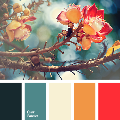
The contrasting combination of dark orange color of paprika and cold blue tones. Blue shades emphasise the brightness of paprika. If you’re going to use them in the interior, the blue shades should prevail, and orange shades should act as a nuances. It is appropriate to decorate a room for a young couple in this scheme, in clothing such a combination is suitable for youth.