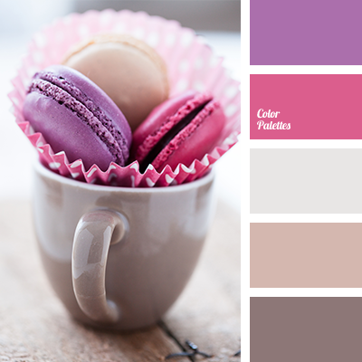
Shades of coffee and cream colours should be diluted with bright colour accents, so all composition does not look too pale. Use these colours for living room or dining area.
Shades of coffee and cream colours should be diluted with bright colour accents, so all composition does not look too pale. Use these colours for living room or dining area.
Copied