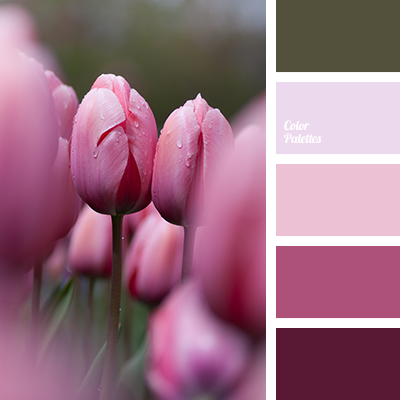
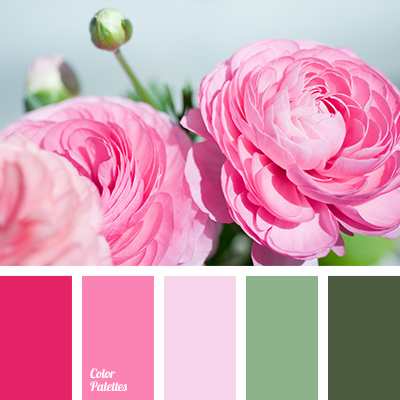
The contrasting combination of shades of cold green and warm red in this range looks harmonious and appropriate. Especially against a pale lilac background. The living room, in the design of which this color scheme will be used, will make an unforgettable impression on the guests. A great option also for the interiors of a cafe or hairdresser, anniversary decoration, corporate events.
Facebook Twitter Pinterest Share
Color Palette #3289
Tags:
boggy, burgundy, color green, color matching, color of olives, color solution for design, colors of spring 2016, colour combination for living room, crimson, dark green, dark swamp color, light olive, lime green, living room colour schemes, pale pink, pink, saturated green, scarlet, selection of pastel tones, shades of dark green, shades of green, shades of light pink, shades of marsh green, shades of pink, shades of spring, vintage colors.