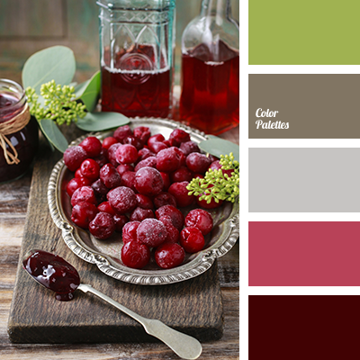
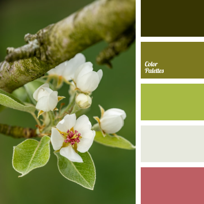
Shades of red and gray do not always combine successfully, often saturated burgundy and wine only exacerbate the “dullness” of gray. However, there are exceptions, one of which is this range. Its semantic center and “highlight” is a light-green shade. This palette will be quite appropriate when decorating a bedroom or office.