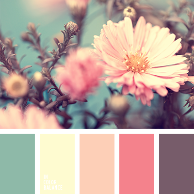
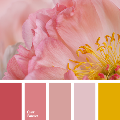
Pastel tones are skillfully shaded by a more contrast color. All together, it looks very harmonious and attractive. This tranquil palette will look appropriate in the design of an exhibition hall, a spacious chief’s office. This color scheme can be used by designers for a fashion clothing for a business people.
Facebook Twitter Pinterest Share
Color Palette #1973
Tags:
beige and pink, color combination for summer, color combination of summer, colors of summer, lilac and orange, lilac and yellow, orange and lilac, orange and yellow, pale pink, palette for summer, pink and pale pink, pink and yellow, pink and yellow shades, shades of pink, shades of sunset, shades of yellow, warm shades for summer, yellow and lilac, yellow and orange, yellow and white.